
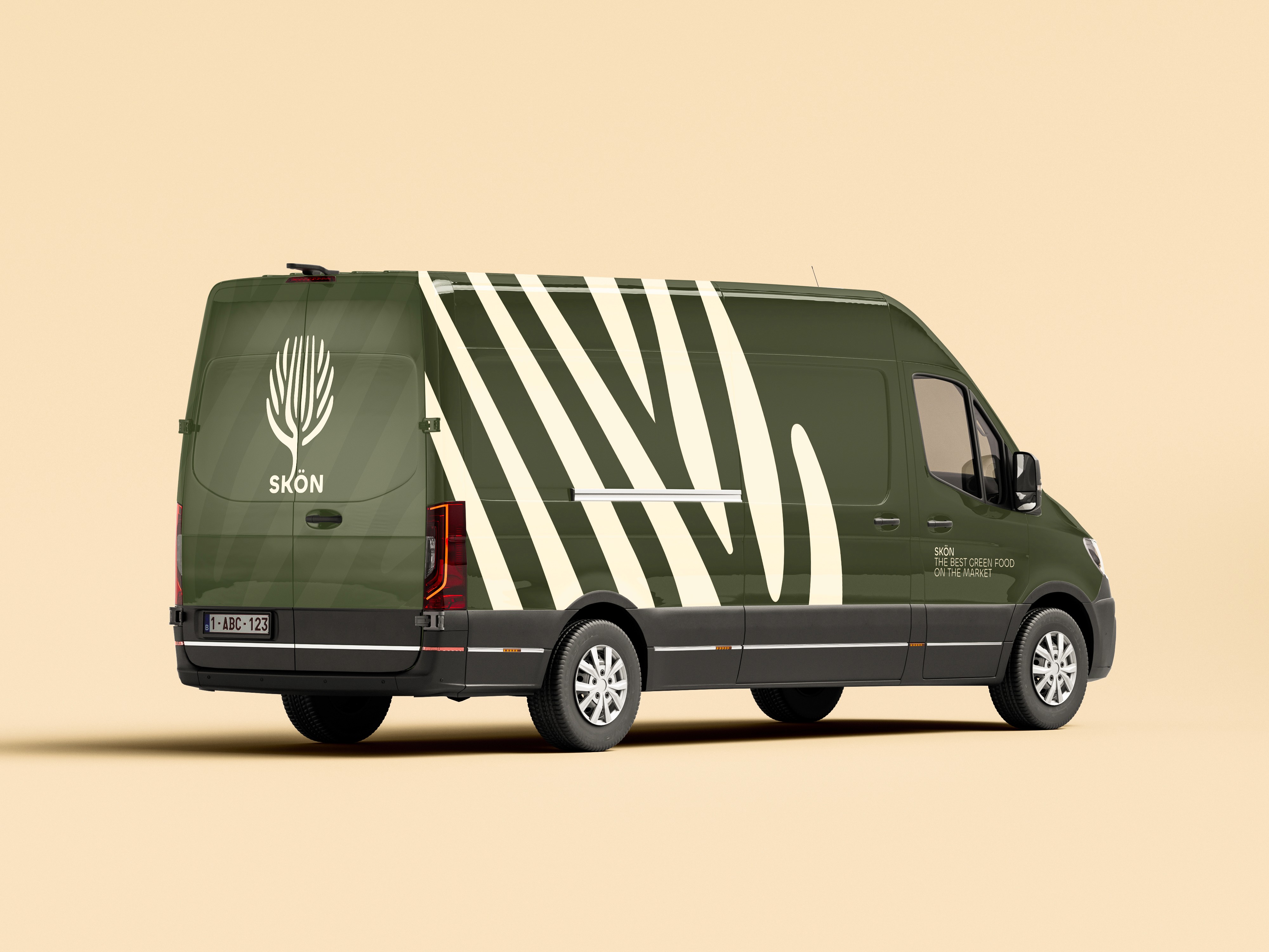
This branding project for the takeaway service Skön focuses on natural, healthy food and clean visual communication. The concept combines a tree with a fork, symbolizing freshness, nourishment, and nature at the heart of the brand. Soft, earthy tones and a simple design system create an identity that feels pure, balanced, and rooted in wholesome, natural eating.
Completion Date
OCTOBER 2O24
Category
Branding & visual identity
Sector
Food & takeaway




Deliverables
Logo design, business card, social media assets, delivery van, packaging design
Credits
Arteveldehogeschool Ghent

