
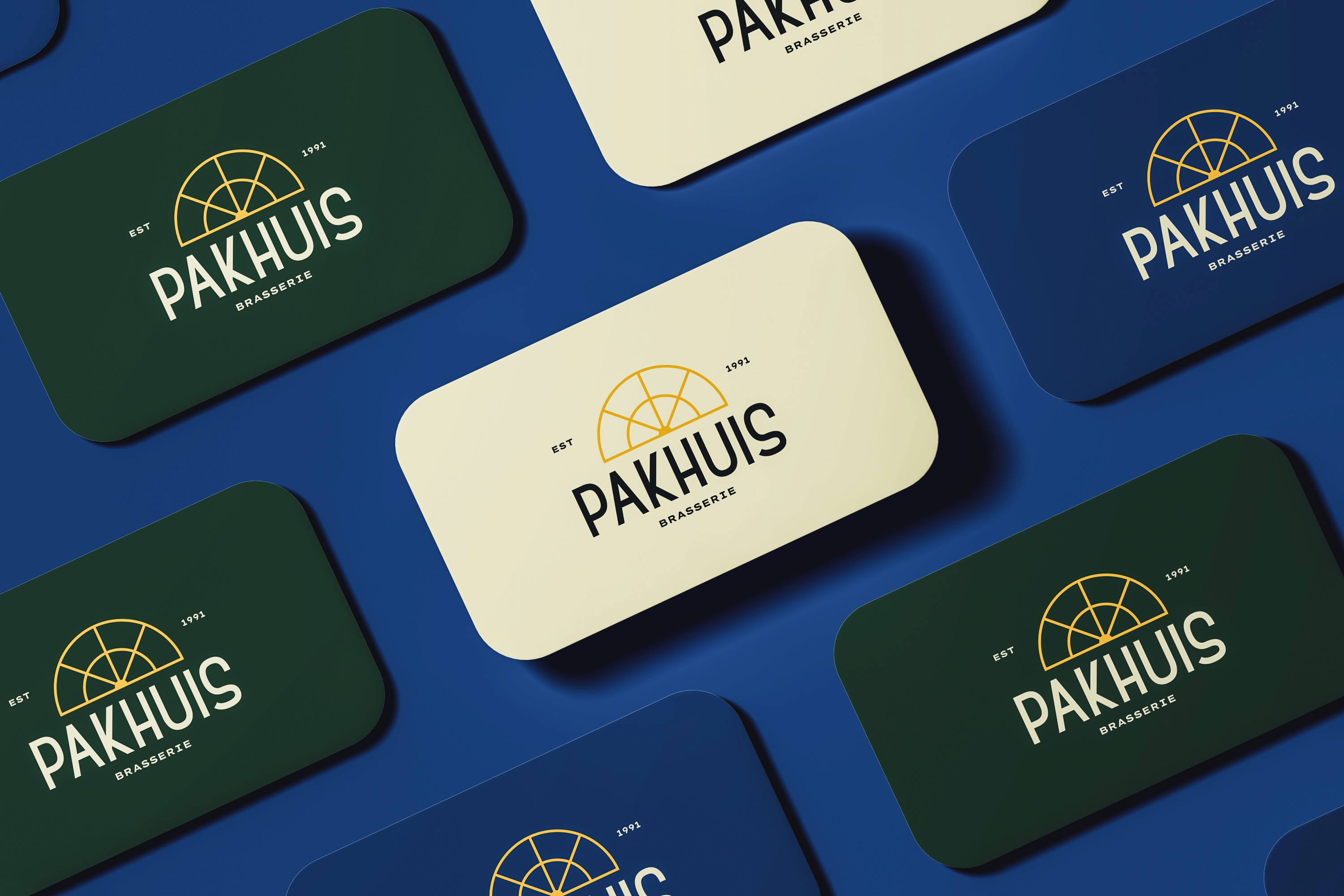
This was a three-day rush project all about rebranding one of Ghent’s iconic landmarks. I picked Het Pakhuis and turned the building’s architectural details into a clean, refined visual identity. The logo comes straight from the structural elements of the façade, and the rest of the rebrand focuses on creating a strong connection between the building and its new visual language. The result is a cohesive system that respects its history but gives it a fresh, modern vibe.
Completion Date
NOVEMBER 2O25
Category
Rebranding & visual identity
Sector
Hospitality & cultural heritage




Deliverables
Logo design, visual identity, tagline, social media, menu, packaging design
Credits
Arteveldehogeschool Ghent

