
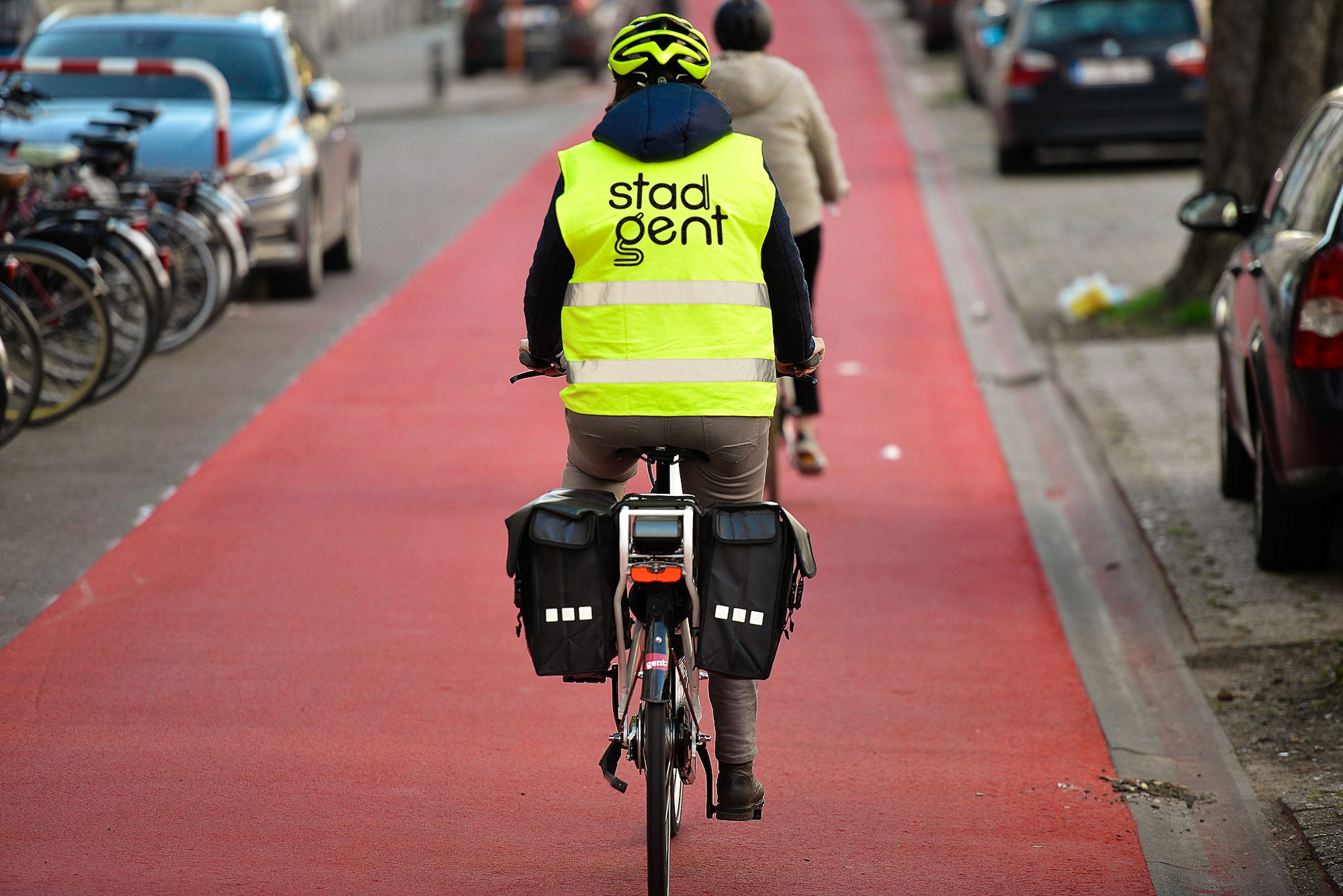
This project is a full rebranding of Stad Gent, my home city. From the start, I wanted to create a branding that works for the future of Ghent, not just today. Ghent is a living city, constantly moving and changing, so the brand needed to feel alive too. That’s why the identity goes beyond a static logo. Motion, sound and colour play a key role in bringing the brand to life across different platforms and moments. The logo was designed to be flexible, recognisable and strong enough to grow with the city. A clear logo system is used: Stad Gent for official communication and Gent for city marketing. Rounded shapes inspired by the city’s rivers and origins balance strength with openness. The result is a future-proof city brand that moves, sounds and feels like Ghent itself. Open, creative, critical and a little rebellious.
Completion Date
JANUARY 2O26
Category
Rebranding & visual identity
Sector
City-Branding







Deliverables
PRIMARY LOGO, SECONDARY LOGO, TERTIARY LOGO, LOGO ANIMATION, CITY BICYCLE, MERCHANDISE, PRINTED COMMUNICATION MATERIALS, CITY VEHICLE, SIGNAGE, STREET NAME SIGNS, POSTERS, BANNERS, ADVERTISING TRAM, FLAGS, BUSINESS CARDS, SOCIAL MEDIA MOTION, SPATIAL LANDMARK
Credits
Arteveldehogeschool Ghent, Lars Crommelinck, Jef Bezoes

